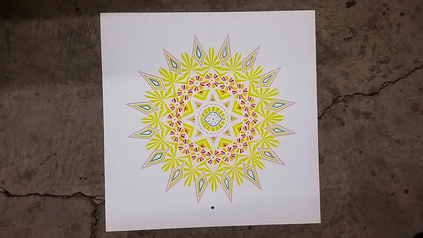
Chloe Parks is a graphic artist, set designer, and illustrator based in Los Angeles, CA. She is currently the resident graphic artist at LA’s TheDreslyn.com, a high end independent fashion boutique in the heart of Downtown LA, and her passion for art and design within the context of the fashion industry is growing daily.
The Print Renegades team most recently worked together with Chloe creating some really rad hand pulled Screen Printed 16" x 20" posters. Basic color design, really rad end result!
These posters were printed using French Pop Tone paper (110# cover) with Permaset Ink, custom Pantone color matched, according to their specifications. Our favorite part about working with artists is their abililty to know exactly what they want, and we act as the medium to take what is in their mind and make it real.
Print Renegades, producing hand made goods straight out of our shop in the heart of the DTLA Fashion District.
Lori Fenn is a true artist. Based in Phoenix, and after calling dozens of print shops in 3 different states, she finally found us. She told us that she had a 12 color poster job, 24" x 24", and that everyone she called either told her that they wouldn't do it, or it would cost her over $50 per print. As always, we stood out as being the diamond in the rough: the print shop that not only says YES to things most wont touch, but our prices were extremely competitive.
So, off to the races. We were able to cut these posters down ourselves to prep for this job, and given the larger-than-normal number of colors in this particular print, every stage of prep just seemed to take a whole lot longer. Mixing 12 custom Pantone colors, burning 12 'Tier 4' sized screens, registering each color...very time consuming.
The printing process is really a science: it doesnt matter if you are printing a 2 color or 200 color job: the process and steps are all the same, and if you have everything down pat, its like anything else: you get into a rhythm and slowly chip away at the creation process. The cool thing is that as you layer color on top of color on top of color, you are able to see the artwork develop in front of your very eyes.
This is why we, as printers, love what we do. Yeah, we print for other people, mainly using their own artwork that they have created, but to be able to have a hand in building the art from a production stand point; to create something identically to someone specifications by using the skills artistic abilities that we have: this is the true art of print!
The time is again upon us: the time where the moon calendar printing begins. We have had Jeremy at Margins as a customer for over 5 years now, and every single year his orders get larger and larger. A great sign of something that is successful!!
This year for the 2015 calendar run, he wanted to try some new things out. So, he asked us if we could start running some samples early (obviously, a few months into 2014 were already beginning to print calendars for the next year) so he really has a jump on things this year!
This post was to showcase the Gold Metallic ink prints. These prints were done on White and Black paper, and personally I thought black looked better but he really liked them on the white paper, but either way you look at it, Gold Metallic ink is amazing regardless of the paper color. Most metallic inks have larger metallic pieces inside the ink, limiting the mesh of screen that you can print through. (Jantex ink says to not print thru anything larger than an 86 mesh. Haha) And with the detail that is in the moon calendars, this would be impossible. We had to go with the Jacquard ink, which allowed us to print through a 200 mesh screen, still holding the detail of the moon calendar print yet still looks like the metallicy goodness that it is! Good work, Jeremy!!